Building this website
First published April 19, 2019Tags: [
jekyll
web-design
design ]
To kick off this blog I figured it would be fitting to write about the creation of this website, and talk about the process as well as some of the design choices I made.
Edit, 6/6/19: It seems as though my taste evolved faster than I expected, and much of the design discussed in this article is no longer actually used in this website. Following this, I would not advise attempting to draw comparisons to design ideas mentioned in this article to the website in its current form, as you may become tempted to call me a liar. A more up-to-date source of inspiration for this website would be the Stanford Encyclopaedia of Philosophy. I am, however, leaving this article otherwise untouched as I still think the 80s were on to something.
1. Motivation
For as long as I can remember, I’ve always enjoyed the idea of having a website. I grew up alongside the internet, and the concept of owning your own plot of web-space was often romanticised by the media (see: iCarly). In my time I’ve hosted a few small, unsuccessful blogs and pages on whatever free hosts I could find - writing about whatever nonsense I had to say was always a good escape from the monotony of day-to-day life.
Since entering university, I’ve noticed that personal websites are apparently a thing in the professional world - who would’ve guessed it. They’re a way to market oneself to a more global community, and can say more than any email spam-bot throwing your CV about ever could. They’re especially a ‘thing’ among academics, and also many high-flying computer science students. As somebody aspiring to fall into at least one of those categories, it seemed like a decent idea to hop onto the online property ladder.
2. Inspiration
My personal decade of choice, in terms of design, would have to be the 80s. I don’t mean the crazy, neon, over-the-top word-art you see passed around as “retro 80s vibes”, I’m talking about the clean, confident, and understated tech advertising of the era. Here are some examples of what I’m talking about:
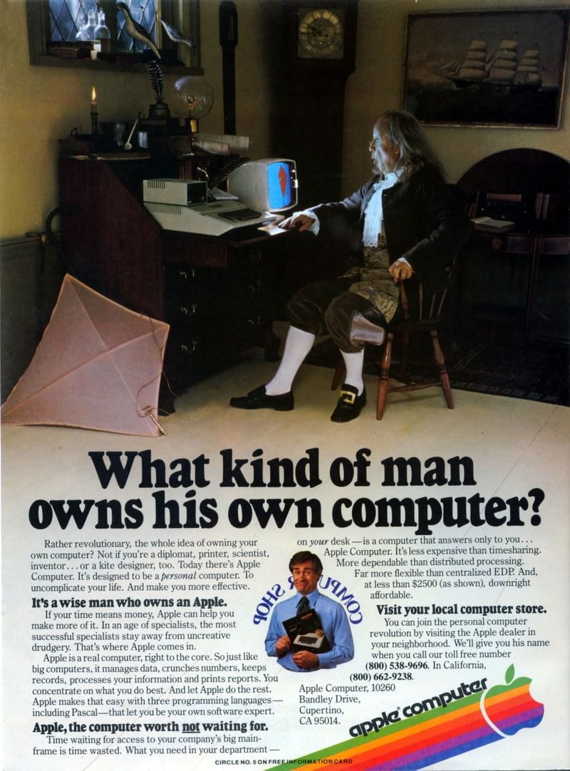
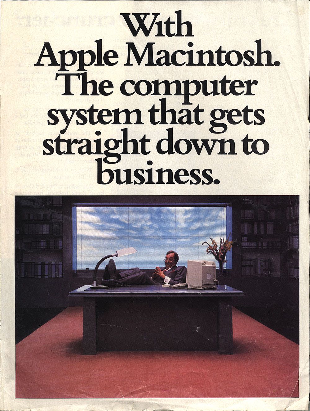
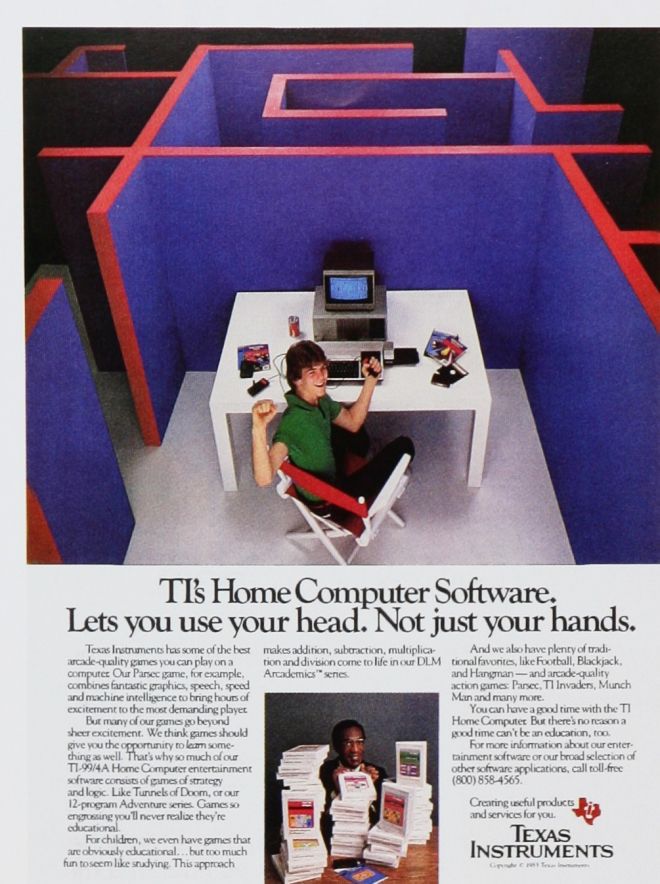
As a ‘genre’, if you can call it that, I think that it’s aged remarkably well. A combination of the sleekness of the overall look, the professional black-on-white simplicity and the unique serif fonts which seem to have fallen out of usage. Couple this with 80s fashion and charm, which is finally making it’s way back into the public eye as ‘vintage’, we have an incredible design rhetoric which holds up today almost arguably more than it did back when it was conceived. A key player in this style of graphic was Apple, who’s typography permeates this website through the font Apple Garamond.
A second, less obvious influence is \(\rm\LaTeX\). I want this website to be as much about mathematics as it is about myself. I needed a design pattern where maths and TeX would not look out of place, and a design where blog posts could look and feel like a standard mathematical article, should such a mood be necessary. I think I’ve managed to strike that vibe, and thanks to MathJax I can display as much exciting maths as I please:
\[G_{\mathbf{j}} = \left[\prod_m\frac{1}{\left(N_m\right)^n}\right] \sum_{\mathbf{k}} \hat{G}_{\mathbf{k}} e^{(2\pi i/N)\mathbf{j}\cdot\mathbf{k}},\ 0\le j_\ell< N_\ell\]Mood set, it was time to plan a layout. I started noting down what I liked and didn’t like about any website I visited in the last few days. The three-column layout idea, though simple, was stolen shamelessly from Stack Overflow’s website right down to the detail of how to deal with small windows. AcademicPages was another big source of inspiration. Before I settled on building from scratch, their template was my starting-point-to-be. Even after changing my mind about that idea it’s easy to see the design points I’ve taken from their template, especially in the side-bar.
A recurring theme in my findings was that so many websites - especially many personal websites - are massively overengineered to the point of insanity. It seems that every increase in browser speed and capability has been met by people adding more needless scripts to their sites, meaning even the simplest sites are surprisingly bloated. I wanted to keep my site as simple and responsive as I could, and to that effect avoided using scripts as much as I could. At the time of writing the only script I have written for this site controls a short tasteful fade-in of the content body.
3. The Process
Before deciding to build up from scratch, I toyed with several ideas, from all inclusive hosts like Wordpress.net, to prebuilt Jekyll templates like the aforementioned AcademicPages. After a lot of trial and error with these formats, I eventually settled on building the website from the ground up, myself.
In my research, I decided to host my website via GitHub Pages, and couple this with Jekyll. Jekyll is a static site generator, which allows one to use a combination of Markdown, Liquid, SASS and more when writing up the site, making the process much less painful than it otherwise would be. Jekyll is also very blog-friendly, and the tools provided (which frankly I am not really qualified to talk about in detail) make the process of setting up a blog a breeze. Thanks Jekyll!
Once the back end was set up, it was then a matter of setting up the layout of the site. This wasn’t my first rodeo with CSS - I’ve written several websites up from scratch for school/personal projects in the past - but even still footers never hit the bottom without a fight, and sidebars are repelled from the side as if magnets are somehow at play. This was by far the most tedious part of the whole process, and it didn’t help that I kept changing my mind about what kind of layout I wanted. Eventually though, columns fell side-by-side, and the header stopped clipping through everything. After all that it is merely a matter of populating the site - part of which I am writing as we speak. After this, GitHub Pages makes deployment of the site completely trivial, which is handy. Just Push to the server and we are away.
4. Closing Remarks
Aside from reaffirming my hatred for writing CSS, I think creating this site has definitely taught me a lot about not just web development and what tools are out there, but also about myself and how I want to be perceived. It would definitely have been much easier to settle on a template or another more accessible option, but I feel like I wanted something I could be proud of, something I could be in full control of, and most importantly something tangible that I can pull out at a moments notice and brag ‘I made that’.
The design of this website will be constantly evolving, alongside both my tastes, and my knowledge of CSS. All the code is freely available on my GitHub.